Table of Contents

Plane-filling trails
Unbiased visualizations of plane-filling curves
What are plane-filling curves?
A plane-filling curve is a curve that twists such that it fills an entire two-dimensional shape, for example a square. You might now think of the path of a child's colouring pencil as it fills a square in a drawing. However, a pencil stroke has some width, whereas a true plane-filling curve is infinitely thin. No matter how many infinitely thin lines you put next to each other on paper, if they are infinitely thin, they will never fill the square entirely—yet inifinitely thin curves exist that do fill the square. The secret of such plane-filling curves is that they are not only infinitely thin, but also infinitely crinkly.
Pólya's curve
An example is Pólya's curve that fills a right isosceles triangle1). To understand this curve, imagine we start with a single line segment (see Figure 1a). We refine this simple drawing in the following way: let p and r be the first and the second endpoint of the original line segment. Imagine a circle with centre line pr and draw another point q halfway on the circle as we follow it clockwise from p to r. Erase the original line segment pr and replace it by two smaller segments pq and qr (see Figure 1b). Next, refine the drawing again by applying the same refinement procedure to each segment, but this time, following the circles in counterclockwise direction. Thus, two line segments become four segments. Note that the middle two segments lie on top of each other, but have different directions (see Figure 1c). If we repeat this refinement process four more times while alternating clockwise and counterclockwise, we get Figure 1d. If we repeat the refinement process ad infinitum, the curve becomes infinitely crinkly, and fills a right isosceles triangle (Figure 1e).
 |
| Figure 1: developing Pólya's curve |
|---|
The challenge of drawing plane-filling curves
Unfortunately, our drawings have now become unreadable. Trouble starts already in the second refinement step with two segments on top of each other. After several levels of refinement, the drawing becomes so dense that we only see a black triangle without any internal structure (Figure 1e). We could sketch the curve, for example, by applying only a small number of refinement steps, replace each line segment by a point slightly to the left of it (see Figure 1f), and then draw a curve along points in order (Figure 1g). This avoids the problem with overlapping line segments. We could embellish the drawing by closing the curve and colouring the interior and the exterior differently (Figure 1h). We could do many things to make the drawing even prettier. Pretty as it is though, the drawing essentially shows a labyrinth: it hides rather than reveals how the curve connects one point to another. Given a pair of points in the plane, the drawing does not allow us to see at a glance how long the path from one point to another along the curve is, and what regions of the plane are visited on the way.
But plane-filling curves have attracted attention not only for the beautiful drawings one can make of them, but also for their practical applications. Simply put, the order in which plane-filling curves traverse points in the plane can bring structure to computer programs that allows them to run efficiently. Key to such applications are, usually, the locality-preserving properties of plane-filling curves: points that are close to each other along the curve tend to be close to each other in the plane, and vice versa2). The importance of these properties inspires the primary goal for this paper: we want to draw plane-filling curves in such a way, that we can see easily which points are close to each other along the curve and which are not, and how points are connected.
Plane-filling curves as a function
Mathematically, a plane-filling curve is a continuous, surjective mapping f from the unit interval (all numbers t ∈ [0,1]) to an image (a set of points) Ut ∈ [0,1] f(t) in the plane that has non-zero area3). The image may be a simple shape such as a square or a triangle, but it could also be something more adventurous, as we will see later. We can trace the curve by going through the points f(t) as t increases from 0 to 1. The mapping is usually chosen such that it is measure-preserving, that is, if we let t go from 0 to 1 at constant speed, then we fill the plane at constant speed. More precisely: for any interval [a,z] ⊂ [0,1], its image Ut ∈ [a,z] f(t) has measure (area) z - a, where we take the area of the complete image of the curve as the unit of area. Thus, f(t) is the point where the curve has arrived after filling a fraction t of the complete image. The reader may now verify that for Pólya's curve, f(0), f(1/2), and f(1) are the points p, q and r in Figure 1: the curve starts at f(0) = p; the curve then leads to q over the infinite refinement of the first of two segments, which fills 1/2 of the complete triangle, hence f(1/2) = q, and it ends at f(1) = r.
To be able to define the function f for a plane-filling curve precisely, we need a notation system. In what follows, curves will often be defined by giving a sequence of groups of four or five numbers: a separate page on notation for plane-filling curves explains how to interpret these numbers.
Visualizing plane-filling curves as trails in a landscape
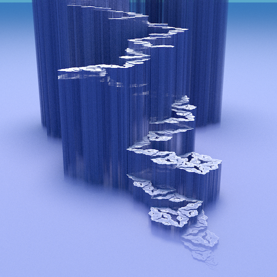
Now that we know how to define a plane-filling curve, we can turn to our primary goal: visualizing a plane-filling curve, such that one can see easily how points are connected and which points are close to each other along the curve and which are not. On this page we explore the following solution: we make a three-dimensional model of the curve, in which each point f(t) = (x,y) is rendered as a three-dimensional point (x,y,t), where the t-coordinate is interpreted as the elevation of the point. We call such a representation a plane-filling trail.
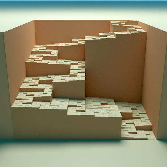
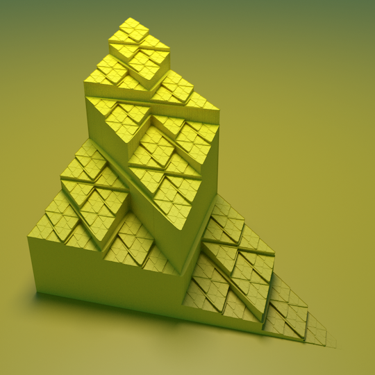
Now, if we would only draw the trail, then the visualization could be rather ambiguous, because we cannot really estimate the location of a three-dimensional point in a two-dimensional view if there is not enough context. We cannot see if gaps between two points of the curve are strictly vertical (showing one point (x,y) visited at multiple times t), or also exist in the projection on the horizontal plane, showing cracks in the image of f (see Figure 2a). But if we fill up the space under each point as well, then the horizontal and vertical relations between points become unambiguous (see Figure 2b). The background that consists of a low plain in the front, a cliff, and a high plain in the back helps by giving a visual frame of reference. Depending on the angle of view, some parts of the curve may be occluded, but one can often guess what they look like because of the self-similar structure of the curve.
 |  |
| Figure 2a: a floating Pólya trail | Figure 2b: a well-supported Pólya trail |
|---|
We now see the curve as a steadily ascending trail on a three-dimensional landscape. We see which points are visited at multiple times far apart: they are the points that are at the foot and at the top of high cliffs. We can see the path followed by the curve on a coarse level at a glance, and, at the same time, at any finer level of detail, as long as the vertical resolution suffices. We can see the shape of the image of the curve (a triangle in this case) and how it is tessellated by the triangles that are the images of subsections of the curve.
An unbiased view
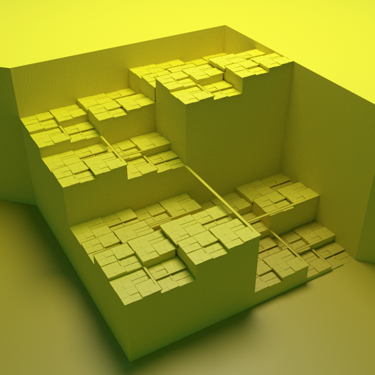
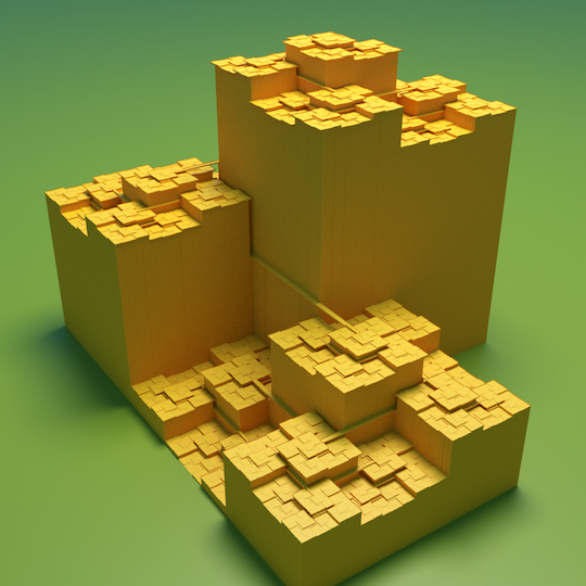
A main feature of a plane-filling trail visualization is that it does not depend on an arbitrary choice of sample points along the curve. Consider, for example, the Balanced Peano curve defined by Δ(1,0,0,1,-1)(0,1,0,1,1)(1,0,0,1,-1) (see notation for plane-filling curves). This variant of the Peano curve can be defined with only three segments. A traditional sketch might draw the segments of some fixed level of refinement, or connect the centre points of the segments of some fixed level of refinement. Such an approach may result in any of the sketches of Figure 3.
 |
| Figure 3: sketches that follow sample points along the balanced Peano curve |
|---|
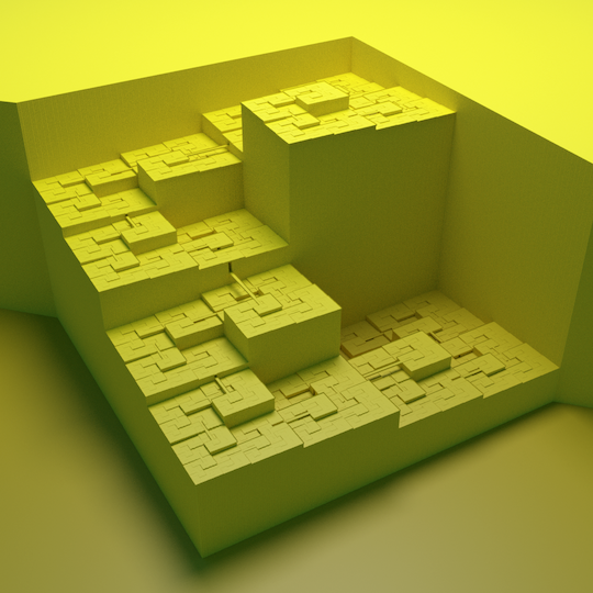
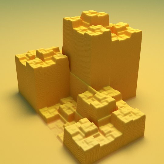
Note how these different sketches give conflicting impressions of the curve, in particular of the main axes of movement. Our plane-filling trail model, in contrast, gives us an unbiased picture that can be read on different levels of detail, as in Figure 4.
 |
| Figure 4: the Balanced Peano curve |
|---|
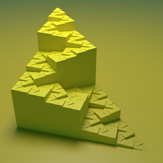
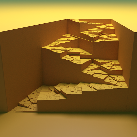
A major advantage of such unbiased views is illustrated by the curve defined by (1,1,1,-1)(1,0,1,1)(0,-1,-1,1) (see notation for plane-filling curves). It fills a trapezoid. The first four levels of refinement are sketched in Figure 5 below.
 |
| Figure 5: a trapezoid-filling curve |
|---|
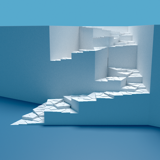
The drawings of Figure 5 look very different from those for Pólya's curve. However, a surprise awaited me when I visualized the curve as a plane-filling trail, as in Figure 6a.
 | |
| Figure 6a: a trapezoid-filling curve | Figure 6b: Pólya's curve |
|---|
Clearly, the trapezoid-filling curve is just a part of Pólya's curve, with essentially the same self-similar structure. This would have been hard to tell from the definitions, but as I soon as I saw the plane-filling trail visualisation of the trapezoidal curve, it was clear to me immediately that I had seen the very same “stairway” before. While making plane-filling trails of other plane-filling curves I found several other curves that turned out to have multiple equivalent definitions with different underlying tessellations. For a discussion of possible alternative visualisations that allow us to see this at a glance, see the comparison to alternative solutions below.
Plane-filling curves from gentle to crooked
Plane-filling curves are complicated. All plane-filling curves intersect themselves: there must be points that are visited by the curve at least three times. Moreover, they are not differentiable. That does not only mean that plane-filling curves turn all the time—it means that when you stand at any point on the curve, it may be impossible to say in which compass direction you can go to move ahead on the curve. Actually walking the curve would be a most confusing experience.
But it seems not all plane-filling curves are equally weird: some are weirder than others. We distinguish wide and narrow curves, curves that cross themselves and curves that do not, and gentle curves versus crooked curves. In short: narrow curves are those whose trails pass through infinitely narrow passages between lower lying (previously visited) and/or higher lying (yet to be visited) areas; in contrast, along wide curves, successive visited areas always share more than a single point. Self-crossing curves are those that really cross, not merely intersect themselves. In the landscape of gentle curves, for any point p one can find a point q that is close by on the curve, so that we can move in a straight line from p to q without jumping over relatively large obstacles (that is, without crossing points that are far away along the curve). Curves for which this is not possible, are crooked.
The exact definitions of these concepts are given (and illustrated) on a separate page on morphology of plane-filling curves.
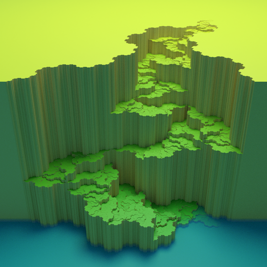
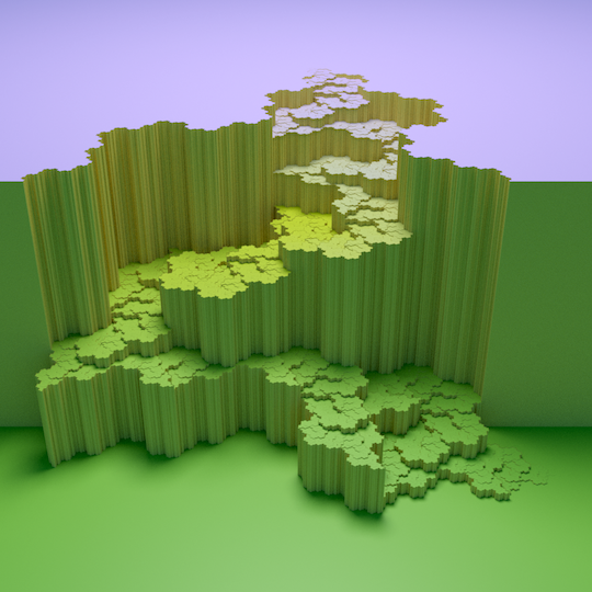
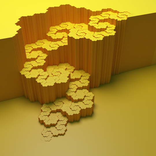
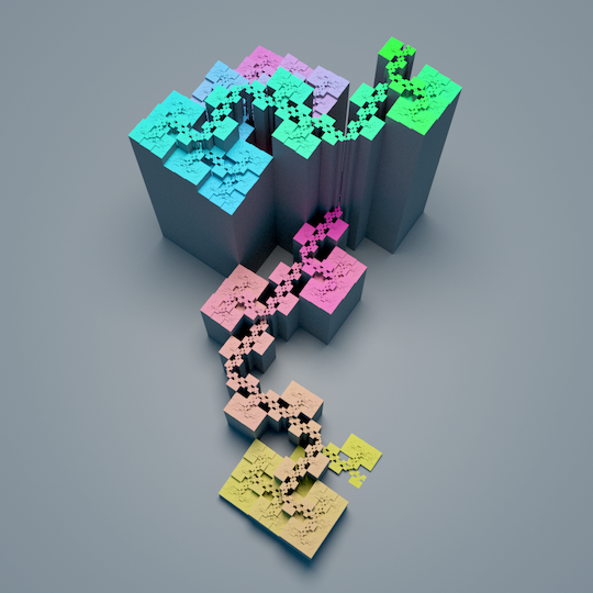
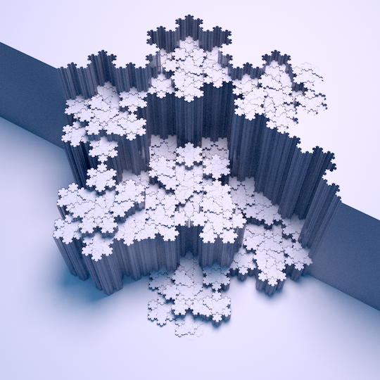
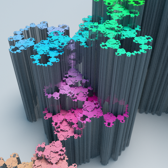
More examples of plane-filling trails
The links below lead to pages that show various examples, including the definitions of the curves. These pages may be slightly out-of-date: the figures on these pages were created with a prototype of the software tool. At the bottom of this page you will find updated and nicer versions of some of these figures, and a link to the software package, which includes software-readable versions of all curve definitions with references to literature.
The most monumental: the jumping Lebesgue/Z/Morton, U, Gray-code, Double-Gray-code, Inside-Out, Burstedde-Holke, and Hill-Z traversals.
The cleanest-cut: the wide and gentle, self-avoiding Peano, Tribonacci Quadrilateral, Tri-Polya, Hilbert, Golden Trapezoid, Pinwheel and Inner-Flip Gosper curves.
The most-rounded: the wide and crooked, self-avoiding Rauzy Triangle, Terdragon, and Gosper curves.
The most architectural: the narrow and probably gentle, self-avoiding Golden Right Triangle, Golden Isosceles Triangle, Koch Snowflake and Dekking curves.
The most mountainous: the narrow and probably crooked, self-avoiding Fractal Pinwheel, Harter-Heighway Dragon, Ventrella's Family, and Gosper Stairway curves.
The most intricate: the self-crossing Peano Ballet, Peano Railroads, and Ventrella's Groovy Crosser.
Implementation: how is it done?
Most figures on this website were made as follows: an iterated function system is constructed by parsing a Ventrella-style curve definition. Sample points along the curve are calculated, and these are snapped to a grid of hexagonal cells4). In principle, each cell is then rendered as a hexagonal column whose height is the t-value of the sample point in the cell (if any). When a cell contains multiple sample points, then the column is generated with open space between consecutive sample points whose elevation difference exceeds a small threshold (similar to the horizontal resolution). To enhance the perception of depth, I sometimes add “dust” (which darkens lower-lying areas of the landscape) and/or small “parapets” along high cliffs, to make the edge of the cliff visible from the “mountain” side (and not only from the “valley” side). In the grey colour scheme, these parapets are marked by their emissive white colour when seen from the “mountain” side; from the “valley” side, they look like any other vertical face. The model is output as a COLLADA file, which is then imported in Blender and rendered with the Cycles ray tracer.
With the current implementation, I found grid sizes of at least 2300 × 2300 cells to be feasible on my laptop; the model is then generated within a few minutes. Blender/Cycles could generate a poster-size image (5000 x 5000 pixels) from such a model in a few hours. For the figures on this website I used a grid of at least 500 × 500 hexagonal cells, from which Blender generated a “web-size” image in a few minutes.
Sample points along the curve are calculated by adaptively expanding the recursive definition to sufficient depth and sampling the end points of the segments on that level. To make use of the resolution of the grid and to avoid spurious holes in the image, the sample points must be sufficiently dense so that the following three conditions are satisfied: (1) if a grid cell is partially covered by the curve, then at least one point inside that grid cell or one of its neighbours is sampled; (2) if a grid cell is entirely covered by the curve, then at least one point inside that grid cell is sampled; (3) if an edge between two grid cells is entirely covered by the curve, then at least one of the adjacent grid cells contains a sample point. The implementation exploits the curve's self-similar structure to compute a good upper bound on the radius r such that any section of the curve whose endpoints are a distance d apart, can only visit points that are within distance dr from the closest end point. To fulfil all requirements, it then suffices to make sure that the distance between sample points along the curve is at most half of the grid edge length divided by r.
Comparison to alternative solutions
As demonstrated above, to get an unbiased visualisation, independent of a particular choice of underlying tessellation or sample points, one needs to visualise the t-coordinate in another way than by the order along a line drawing sketch of the curve. On this page, we explored the approach of rendering t as elevation. Another solution, frequently used, is to change the colour of the curve from beginning to end according to some grey-scale or rainbow-like progression. This allows a visualization that truly shows the curve, not merely its definition, colouring the entire image of the curve according to the order in which points are visited. Examples are shown in Figure 7 below.
 |  |
 |  |
| Figure 7: colour progression images of Pólya's curve and the equivalent trapezoid-filling curve. | |
|---|---|
In comparison to the plane-filling trail method, the following differences can be observed. The colour progressions show the complete curve without distortion, whereas the plane-filling trail methods are affected by perspective distortion and occlusion. However, the colour progressions have less discernible detail. One complicating factor is that the perception of colour depends very much on the local context. As a result it is sometimes hard to see where the curve goes: in the grey-scale image, the Pólya curve sometimes seems to alternate between becoming brighter and darker, or may seem to cross itself. The colour image shows more detail than the grey-scale image, but seeing where the curve goes at a glance seems to be harder and the similarity to the trapezoid curve is far from obvious. I guess this is because our visual system does not perceive translations and scalings on the colour scale as similarity transformations.
Colour gradients do not expose similarities between different parts of the curve well and they do not communicate distances along the curve well, because colour difference establishes, at best, an ordinal scale, not an interval scale. This is where the plane-filling trails excel, since elevation gives us an effective interval scale on which we can read distances along the curve. In the plane-filling trail models, high, steep slopes reveal pairs of points that are close in the plane but far apart along the curve. Narrow corridors reveal sections between points that are relatively close to each other along the curve, but far apart in the plane. Wide corridors show sections of the curve that have good locality-preserving properties in both directions.
When similarity is not (quite) preserved
The attentive viewer may notice a particular aspect of the plane-filling trails: the visualization is not scale-independent. A section of the curve that is similar to the curve as a whole will look like the curve as a whole, but considerably flatter. If the curve is scaled down by a factor x in the plane, its area shrinks by a factor x2, and so does the one-dimensional pre-image, that is, the projection on the vertical axis. Relative to the horizontal dimensions, the vertical dimension is therefore scaled down by an additional factor x. This has advantages and disadvantages: on the one hand, it means that we have to make the model quite high to be able to see details; on the other hand, it may make it easier to focus on the coarser levels of detail. In any case, despite the flattening, I believe the plane-filling trails still tend to show a wider range of levels of detail clearly than traditional drawings achieve with line work and colours.
Another aspect that one should be aware of, is that similarity by reversal, that is, by reflection of the pre-image of the curve, may not be as easy to recognize as similarity by rotation, reflection, translation and scaling of the image. It may not be visually obvious that one part of the terrain is the same as another part of the terrain turned upside down.
Remaining challenges
In some curves, jumps result in tunnels in the landscape. This creates problems when the exit lies on a very gentle slope. Where the surface level and the tunnel floor level are very close, the current implementation would merge the two levels into one, and thus block the tunnel exit. I also tried removing the top level in such cases, but this tends to result in carving rather long excavated roads into the surface and in substantial displacement of the exit of the actual tunnel. For now, the best solution seems to be to try to avoid tunnel exits on gentle slopes, for example by routing the jump along the contour lines of the landscape, but this is not always possible. For this reason, another solution for the visualization could still be desirable.
Finally, to enable the production of 3D-printable models, a solution to prevent (near-)degeneracies around bridges and saddle points must be implemented.
Downloads
- Software v. 1.01 (c++ code, manual and input files, tested on Linux and MacOS)
- Software v. 1.1.α1 (faster than v. 1.01 and with better console output, but tested only on MacOS and only on the inputs for the figures below; comes with version 1.01 manual; updates to input files may be subject to further changes)
- Brief introduction submitted to the Computational Geometry week Media Exposition 2020
- Extended introduction (on arXiv)
- 27 colourful examples (1080×1080 pixels' versions of the figures below, 57 MB in total)


